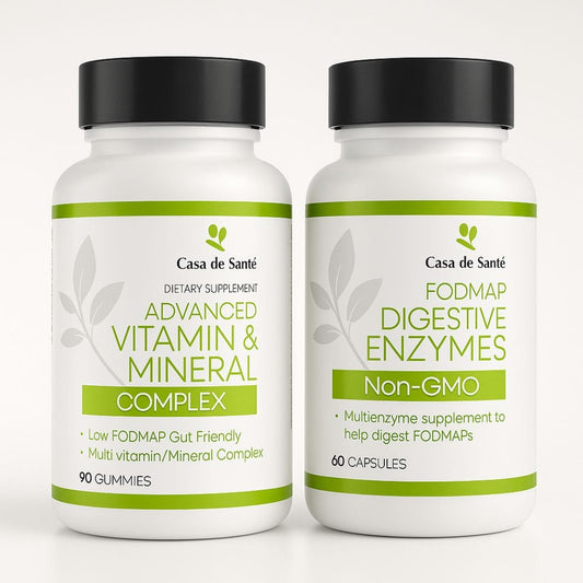
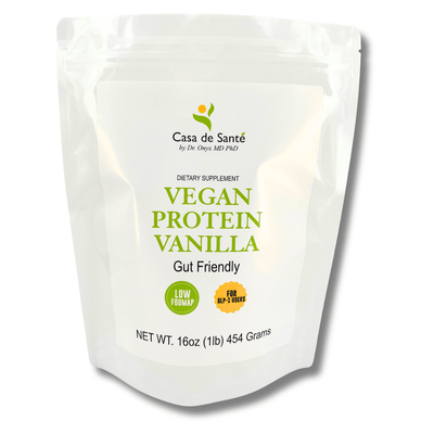
The Ultimate Guide to Creating Effective Supplements Logos




The Ultimate Guide to Creating Effective Supplements Logos
In the competitive supplements industry, your logo is often the first point of contact between your brand and potential customers. A well-designed logo can communicate trust, quality, and effectiveness in seconds—essential qualities for products that consumers literally put into their bodies. Whether you're launching a new supplement brand or refreshing an existing one, this comprehensive guide will walk you through the process of creating a logo that resonates with your target audience and stands out in a crowded marketplace.
Understanding the Supplements Market
Before diving into design elements, it's crucial to understand the landscape in which your logo will exist. The supplements industry has exploded in recent years, with global sales projected to reach $216.3 billion by 2026. This growth has led to intense competition and market saturation, making distinctive branding more important than ever.
Supplements span numerous categories—from vitamins and minerals to protein powders, herbal extracts, and specialized formulations for everything from joint health to cognitive enhancement. Each segment has its own visual language and consumer expectations, which should inform your logo design approach.
Know Your Target Audience
Different supplements appeal to different demographics. A protein powder targeting bodybuilders will require a very different visual approach than a vitamin blend for seniors or a wellness supplement for busy professionals. Research your specific audience segment thoroughly—understand their values, aesthetic preferences, and what visual cues signal quality and trustworthiness to them.
For example, supplements targeting fitness enthusiasts often feature bold, dynamic logos with strong typography and symbols of strength or movement. In contrast, products for health-conscious professionals might employ cleaner, more minimalist designs with sophisticated color palettes that convey precision and science-backed quality.
Analyze Competitor Logos
Study the logos of both direct competitors and successful brands in adjacent categories. Note recurring elements, color schemes, and stylistic approaches. This research serves two purposes: it helps you understand industry conventions (which can be important for consumer recognition) and identifies opportunities to differentiate your brand visually.
Create a mood board of competitor logos, noting what works well and what doesn't. Look for gaps in the visual landscape that your logo could fill. Perhaps most brands in your niche use blue and white with leaf imagery, creating an opportunity for your brand to stand out with a different color palette or symbolic approach while still communicating health and naturalness.
Essential Elements of Effective Supplement Logos
Successful supplement logos typically balance several key elements that communicate specific brand attributes while remaining visually appealing and memorable. Understanding these components will help you make informed decisions during the design process.
Color Psychology for Supplements
Color choice dramatically impacts how consumers perceive your supplement brand. Green typically signifies naturalness, health, and growth—making it popular for herbal and plant-based supplements. Blue conveys trust, reliability, and cleanliness, often used for science-backed formulations. Black and metallic tones suggest premium quality and strength, common in performance-enhancing supplements.
Consider also how colors work in combination. A primarily green logo with gold accents might communicate natural ingredients with premium quality, while a blue and white palette suggests clinical effectiveness. Limit your palette to 2-3 colors for maximum impact and recognition.
Typography That Communicates
Font selection speaks volumes about your brand's personality. Sans-serif fonts like Helvetica or Futura project modernity, clarity, and scientific precision—ideal for research-backed supplements. Serif fonts can convey tradition, reliability, and established expertise, suitable for brands emphasizing time-tested formulations. Custom typography can create a truly distinctive identity but requires skilled execution to avoid appearing amateurish.
Whatever typography you choose, ensure it remains legible at various sizes, from large packaging to small digital icons. Many supplement brands incorporate both a primary logotype (the brand name in a specific font treatment) and a separate symbol or icon that can stand alone when needed.
Symbolic Elements
Many supplement logos incorporate symbolic elements that instantly communicate key brand attributes. Common symbols include leaves or plants (suggesting natural ingredients), molecular structures (indicating scientific formulation), shields (implying protection and safety), or stylized human figures (representing strength, vitality, or transformation).
The most effective symbols are simple enough to be recognizable at small sizes yet distinctive enough to be uniquely associated with your brand. Avoid overly complex illustrations that lose detail when scaled down for applications like mobile app icons or social media profiles.
Design Principles for Supplement Logos
Beyond specific elements, certain design principles particularly apply to creating effective supplement logos. These guidelines will help ensure your logo performs well across all applications and stands the test of time.
Simplicity and Memorability
In the supplements space, where consumers often make quick decisions based on brand recognition, simplicity is paramount. A cluttered logo with too many elements or complex details will fail to create a strong mental imprint. Aim for a design that can be sketched from memory after a brief viewing—this is often a good test of effective simplicity.
Consider iconic supplement brands like Optimum Nutrition or Nature Made. Their logos use clean, straightforward designs that remain instantly recognizable even when glimpsed briefly on a crowded store shelf. This simplicity also ensures the logo reproduces well across various media, from product packaging to digital advertisements.
Practical Applications and Versatility
A supplement logo must function effectively across numerous applications, from product packaging and labels to website headers, social media profiles, and potentially even apparel or promotional items. This versatility requirement should inform your design process from the beginning.
Packaging Considerations
Supplement packaging presents unique challenges and opportunities for logo display. Your logo may appear on bottles, pouches, boxes, and blister packs—each with different space constraints and production requirements. Consider how your logo will look on curved surfaces (like bottles) and whether it remains effective when printed on different background colors or materials.
Many successful supplement brands create a "lockup" system with several approved logo variations optimized for different contexts. This might include horizontal and vertical arrangements, versions with and without taglines, and simplified versions for very small applications like pill imprints or bottle caps.
Digital Presence
In today's market, most supplement discovery happens online. Your logo needs to perform well as a small social media avatar, a website favicon, and in various digital advertising formats. Test your design at very small sizes (as small as 16×16 pixels for favicons) to ensure key elements remain recognizable.
Consider also how your logo appears on different screen types and in different lighting conditions. A design that looks perfect on your designer's calibrated monitor might lose impact on a consumer's smartphone viewed in bright sunlight. Testing across devices helps ensure consistent brand recognition.
Working With Professional Designers
While DIY logo creation is possible with today's design tools, the supplements industry's competitive nature and regulatory scrutiny make professional design assistance particularly valuable. A professional designer brings not just aesthetic skills but understanding of industry standards and consumer psychology.
Finding the Right Designer
Look for designers or agencies with specific experience in the health, wellness, or supplements space. They'll understand the unique challenges and opportunities in this sector. Review portfolios carefully, paying attention to how their previous work balances creativity with clarity and brand positioning.
Platforms like Behance, Dribbble, and specialized agencies like Nutrition Design Group or SupplementBrand offer access to designers with relevant experience. Expect to invest between $1,500 and $10,000 for a comprehensive logo development process, depending on the designer's experience and the package of deliverables.
The Design Brief
A thorough design brief is essential for successful collaboration. Include information about your target audience, key product benefits, brand values, and competitive positioning. Provide examples of logos you admire (both within and outside the supplements industry) and explain what specifically appeals to you about them.
Be clear about required deliverables, including file formats, color variations, and any specific applications you need the logo optimized for. The more comprehensive your brief, the more likely the designer will create something that truly meets your needs.
Testing and Refining Your Logo
Before finalizing your supplement logo, thorough testing can prevent costly mistakes and ensure maximum effectiveness. Several testing approaches can provide valuable feedback.
Consider conducting focus groups with members of your target audience to gauge their immediate reactions and associations. Does the logo convey the qualities you intend? Does it feel appropriate for the product category? Does it inspire trust and quality perceptions?
A/B testing different logo variations in digital advertising can provide quantitative data on which design drives better engagement and conversion rates. This approach is particularly valuable if you're refreshing an existing logo and want to measure improvement against the current design.
Regulatory Considerations
The supplements industry faces significant regulatory scrutiny, and your logo should avoid elements that might trigger compliance issues. Avoid design elements that could be interpreted as making medical claims or promising specific results. Similarly, be cautious about symbols that might imply pharmaceutical-grade testing or approval if your products haven't undergone such processes.
Consider consulting with a regulatory expert to review your logo design before finalization, particularly if you're operating in multiple international markets with varying regulations.
Conclusion
Creating an effective supplement logo requires balancing artistic creativity with strategic brand positioning and practical considerations. The most successful logos in this space communicate key brand attributes instantly while establishing a distinctive visual identity that stands out in a crowded marketplace.
Whether working with professional designers or developing your logo in-house, focus on creating something that authentically represents your product's benefits and values while meeting the practical requirements of various applications. With thoughtful planning and execution, your logo can become a powerful asset that builds trust, drives recognition, and ultimately contributes to your supplement brand's success.